Responsive templates
Layouts adapt from large desktop screens down to small phones.
Features / Sell online
Most shoppers will visit on a phone. Every template, product page and checkout is designed to work there first.
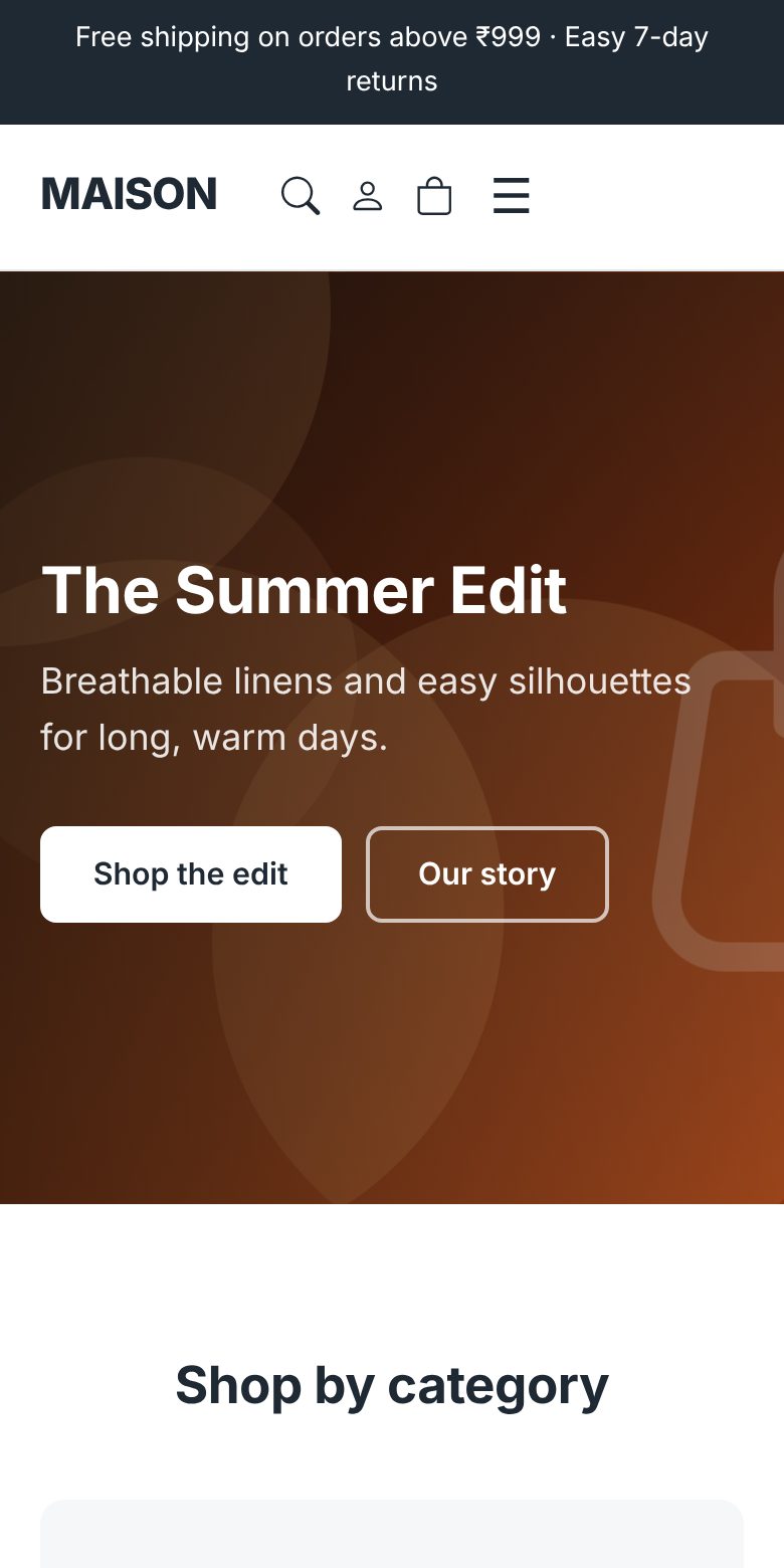
Layouts adapt from large desktop screens down to small phones.
Switch between desktop, tablet and phone in the editor to see exactly what visitors will.
Pages are cached and images are converted to WebP so they open quickly on mobile data.
The cart and checkout are laid out for small screens, with UPI and COD options.
Build your page in the editor.
Switch to the phone preview and adjust.
Visitors on any device get the right layout.